Website last updated: 15-5-2026
Home
Book & Film reviews
Competitions
Event
FSWL Merchandise
In Memoriam
Interviews
James Bond 007 collection
James Bond 007 films
James Bond 007 games
James Bond 007 literature
James Bond 007 news
James Bond 007 products
James Bond 007 shop
James Bond 007 stars
James Bond Fan Clubs
Swedes in the Bond films
A retrospective look at Tomorrow Never Dies poster campaign
By: Nicolas Suszczyk
Published:
2017-12-20
2017-12-20
It wasnŌĆÖt, as it happens with Bond films - and action films in general - today, the ultra-simplistic shots of an actor in a monotone background with the title logo but a much more complex and inclusive graphic design where the girls, the villains, the cars, the action scenes and even some additional characters popped up in somewhere in the canvas.
As opposed to GoldenEyeŌĆÖs relatively minimalistic teaser posters, featuring a gold-hued closeup of Pierce Brosnan aiming at the viewer and another shot of Brosnan in a more classic pose with the 007 logo in the background, the teaser campaign for Tomorrow Never Dies already began to play with more digital effects.
Art director Randi Braun, who also worked on GoldenEye, cleverly used publicity photos of Pierce Brosnan as 007, taken by legendary photographer Keith Hamshere [our interview with Keith], over a very modern looking red gun barrel. Just like in the previous film, to reaffirm Brosnan was the new era Bond, the actorŌĆÖs face was heavily promoted in a typical fashion but with a modern twist, like if reminding audiences this is the same 007 but in a contemporary context.
One of these posters (featuring Bond in black tuxedo and his new handgun Walther P99) went for the international market, with a respective quad (landscape) version for the UK. The other one, used exclusively in America, consisted on a detail closeup of BrosnanŌĆÖs facial features. The 007 logo was placed in different shades of red, grey and white all over his face, in a very imaginative and unique design.
However, Japan opted for an even more innovative design: one with Bond kissing Michelle YeohŌĆÖs character Wai Lin with Teri HatcherŌĆÖs character Paris in the background, and another teaser artwork that had Bond in a more ŌĆ£powerful manŌĆØ attitude, arms crossed and dressed in an all-black suit (a colour often associated with power) against an all-red background.
The Japanese Tomorrow Never Dies poster. ┬® 1997 Danjaq LLC. & United Artists Pictures. An MGM Company. All rights reserved.
Banners and postcards were produced with similar photomontages: Bond and Wai Lin on a BMW motorbike, Bond in tuxedo with Paris Carver (Teri Hatcher), Bond in an action mood shooting his Walther PPK, the villains Elliot Carver (Johnatan Pryce) and Stamper (G├Čtz Otto), all posing against a background of TV screens, mostly in red or blue.
The filmŌĆÖs title logo was designed with an italic Serpentine DBol font, with a black and red overlay, and displayed over a metallized version of the 007 gun logo, firmly showing the modernization of a classic and well-known icon. The same font, albeit not in italics, was used for the credits in the US posters.
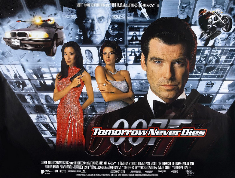
The main differences for the Tomorrow Never Dies poster campaign can be seen in the theatrical artwork. The US theatrical poster showed Bond in black holding his gun, next to Paris Carver and Wai Lin in blue cocktail dresses, over a background filled of red-hued TV screens showcasing the action scenes of the film, emphasis being made in the gadget-laden BMW 750iL car and the motorbike chase over Vietnam, two of the most important action scenes of the movie. The face of the villain Carver appears on top of the TV screens, giving the idea of an omniscient man who applies his power through his media empire.
On the other hand, the International poster design kept basically the same idea, although the background screens donned a blueish shade and Wai LinŌĆÖs dress was digitally coloured in red. This time, Brosnan is seen with his trademark Brioni tuxedo.
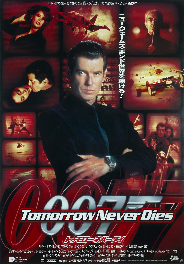
Japan also gave a interesting note for the theatrical graphic promotions of the film: the design was similar to the American poster, but this time with Bond dressed in black and with his arms closed as in the Nipponese teaser artwork. The red TV screens showed less action scenes and had the image of Bond kissing Wai Lin for their teaser campaign. Paris, provocatively dressed in a black shirt, also appears inside one of the screens.
Released on December 12, 1997, Tomorrow Never Dies didnŌĆÖt share the same success as GoldenEye (the competition with James CameronŌĆÖs hit Titanic was tough!), yet the movie succeeds - artistically and dramatically - in establishing Pierce Brosnan was the Bond of the Millenium and reminding the audiences that agent 007 came back to stay.
Tags:
#articles
#articles
#michelle_yeoh
#nicolas_suszczyk
#pierce_brosnan
#tomorrow_never_dies
Tweet